Tools
Heatmaps
BTS Heatmaps make market seasonality easier to research. Each heatmap turns completed calendar-year price history into an interactive weekly view of return, consistency, volatility, relative performance, data depth, and BTS Opportunity Zones across indexes, sectors, and industries.
Open a heatmap from the table to compare market groups and flag weeks or BTS Opportunity Zones for deeper research. Heatmap cells and BTS Opportunity Zones are historical summaries, not forecasts or trading recommendations.
What you can research
- Seasonal behavior: see how selected indexes, sectors, or industries behaved during each BTS calendar week.
- Consistency: compare average return, median return, positive-week rate, and win rate versus the S&P 500.
- Risk context: review weekly volatility and return-to-volatility measures before treating strong colors as meaningful patterns.
- BTS Opportunity Zones: highlight selected All Data periods of unusually strong relative strength or weakness versus the S&P 500.
- Evidence depth: check how many observations support each cell and whether the selected history window is complete or limited.
Open a heatmap
| Heatmap | Plans | Best for |
|---|---|---|
| Major Indexes | Free Account | Broad U.S. market seasonal context across major indexes and benchmarks. |
| Industry Sectors | Pro | Sector-level seasonal context across major S&P groups. |
| Key Industries | Ultra Pro | Industry-level seasonal context for more granular comparison. |
Metric views
Each heatmap includes eight metric views. The color scale, selected-cell value, and metric explanation update with each view.
| View | What it shows |
|---|---|
| Avg Weekly Return | Shows the average historical weekly return. |
| Median Weekly Return | Shows the median historical weekly return. |
| Positive Week Rate | Shows how often the group finished that week with a positive return. |
| Weekly Volatility | Shows how much weekly returns varied. |
| Return / Volatility | Shows how average return compared with weekly volatility. |
| Data Points Used | Shows how many historical observations support the selected cell. |
| Avg Relative Weekly Return vs S&P 500 | Shows how the group performed versus the S&P 500 in the same BTS week. |
| Win Rate vs S&P 500 | Shows how often the group beat the S&P 500 in that week. |
For S&P 500 rows, S&P 500-relative metrics are not applicable because the S&P 500 is the benchmark.
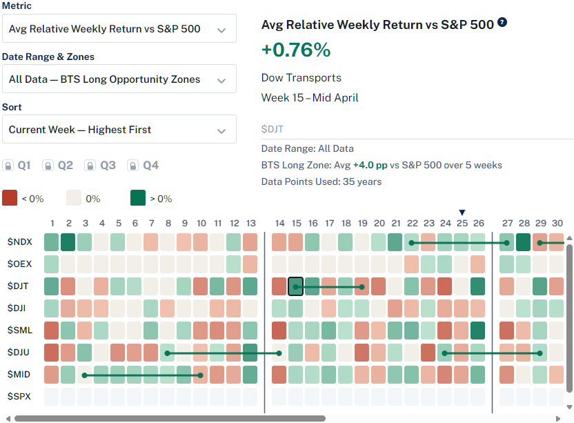
BTS Opportunity Zones
BTS Opportunity Zones are proprietary All Data research overlays that mark selected historical multi-week periods of unusually strong relative strength or weakness versus the S&P 500.
- BTS Long Zones: highlight selected historical periods of relative strength versus the S&P 500.
- BTS Short Zones: highlight selected historical periods of relative weakness versus the S&P 500.
- History Range & Zones selector: choose All Data — BTS Long Zones or All Data — BTS Short Zones to show one side at a time.
- Selected-cell details: when a cell is inside a BTS Opportunity Zone, the metrics pane shows the average relative move versus the S&P 500 and the number of weeks in the zone.
The examples below show how the two selector modes appear on a heatmap: BTS Long Zones for selected relative-strength periods and BTS Short Zones for selected relative-weakness periods.
BTS Long Zones example
BTS Short Zones example
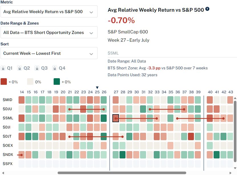
BTS Opportunity Zones are historical research overlays, not forecasts, trading signals, or trading recommendations.
History ranges and controls
History Ranges compare the full completed-year record with recent completed-year windows. The current packages are based on completed years through 2025: Recent 10 Years covers 2016–2025, Recent 5 Years covers 2021–2025, and Recent 3 Years covers 2023–2025. BTS Long Zones and BTS Short Zones use the All Data model.
- History Range & Zones selector: switch among All Data, Recent 10 Years, Recent 5 Years, Recent 3 Years, All Data — BTS Long Zones, and All Data — BTS Short Zones.
- Quarter toggles: show or hide Q1, Q2, Q3, and Q4 to focus on a specific part of the year. In the BTS Long Zones and BTS Short Zones selector modes, weeks 1–52 stay visible.
- Week 53 toggle: include or hide the extra BTS week created by the day-of-year week convention.
- Sorting: use the default display order, sort by Selected Range Avg, or sort by the current week.
- Selected-cell details: click a cell to see the metric value, group, week, History Range, History Status or BTS Opportunity Zone status, and Data Points Used.
Methodology notes
These notes summarize how BTS converts daily closes into weekly seasonal observations.
- Return type: price return using Daily Close data.
- Weekly close: the last available trading close inside each BTS week bucket.
- BTS week numbering:
floor((day_of_year - 1) / 7) + 1. BTS weeks are not ISO weeks. - Weekly return:
100 × (weekly_close / prior_weekly_close - 1). - Week 1 prior close: the prior calendar year’s final available trading close.
- Relative metrics: S&P 500-relative calculations are matched by calendar year and BTS week number.
- Week 53: Week 53 is preserved when available and may have fewer data points than ordinary weeks.
- Industry eligibility: industry groups must have at least three usable completed calendar years for ordinary BTS weeks 1–52 before they are eligible for heatmap presentation.
- Downloads: heatmaps are interactive research displays, not raw-data download products.
Strong colors and BTS Opportunity Zones can highlight recurring historical behavior, but each cell should be interpreted alongside its History Range, Data Points Used, volatility, and relative-performance context.
Start with the Major Indexes Heatmap for broad market context, or compare plans for sector and industry-level views.