10-Month SMA Timing Model, Backtest Video
The 10-month SMA timing model makes one decision per month. That simplicity is the entire point. This backtest asks the only question that matters. Does the drawdown control earn its keep when you pay for it in lag and whipsaw?
At month-end, the rule asks a single question about trend persistence and flips exposure in or out. That simplicity is the appeal. It is also the failure mode. A slow filter can reduce exposure during prolonged selloffs, but it can also re-enter late after sharp bottoms and get chopped up when price ranges around the moving average.
This video backtests the full rule set on SPY under explicit timing and assumptions, then reads the scorecard in a fixed order. Exposure and trading behavior come first, risk comes next, payoff comes last. Then we walk the equity curve so you can see the exact regimes where the model protects you, and the exact regimes where it taxes you for that protection.
Why the 10-Month SMA Timing Model gets attention
The 10-month SMA timing model sits near the center of risk-reduction timing research because it reduces the idea to one transparent, auditable decision rule. It was popularized by Mebane Faber and is widely cited because it is simple enough to implement, benchmark, and stress-test without a large parameter stack.
The core hypothesis is simple. Trend persistence exists, and large drawdowns often unfold over many months rather than days. A monthly filter tries to exit only after deterioration is sustained and re-enter only after recovery is sustained. If that premise holds, the expected benefit is primarily drawdown and volatility control, not a guaranteed improvement in terminal return.
Skeptics focus on the failure modes that the rule cannot avoid. A monthly SMA filter can lag at turning points, and it can whipsaw in sideways markets when price repeatedly crosses the trend line. That is why this episode treats the model as an exposure overlay and evaluates it as a trade-off across regimes, not as a story about forecasting.
What the video delivers
- The full strategy spec. Every input, condition, and decision rule is stated explicitly.
- Signal and execution timing. Signal evaluation and trade execution are specified so the backtest is reproducible.
- Implementation-grade clarity. Definitions and rules are stated explicitly to reduce ambiguity.
- A transparent benchmark. The benchmark is run under the same assumptions for a clean comparison.
- On-screen backtest settings. Timeframe, costs, cash treatment, and exclusions are stated in the video.
- A head-to-head scorecard with a fixed order. Exposure first, risk second, payoff last.
- An equity-curve walkthrough that matches the scorecard. Narration ties the numbers to what actually happened across the backtest window.
- Regime-aware interpretation. The episode pressure-tests strategy behavior through distinct market conditions.
- Frictions treated as real. Time in market, trades per year, and costs are stated so you can judge whether it clears your trading constraints.
- A structured conclusion. Summarized as Benefit, Cost, Role so you can evaluate it quickly and consistently.
Head-to-head scorecard
Watch the video to see the full head-to-head scorecard unblurred. The values are blurred here on purpose because the scorecard is not meant to be skimmed in isolation. In the episode, we reveal it in a fixed order and tie the numbers to the equity curve so you can see exactly what drove each line.
Trading rules
This strategy is defined by a single state variable: whether SPY’s month-end close is above or below its 10-month simple moving average (SMA). Signals are evaluated and trades execute on the month-end close (trade-on-close; assumes a market-on-close order). Let “t” denote the month-end signal bar.
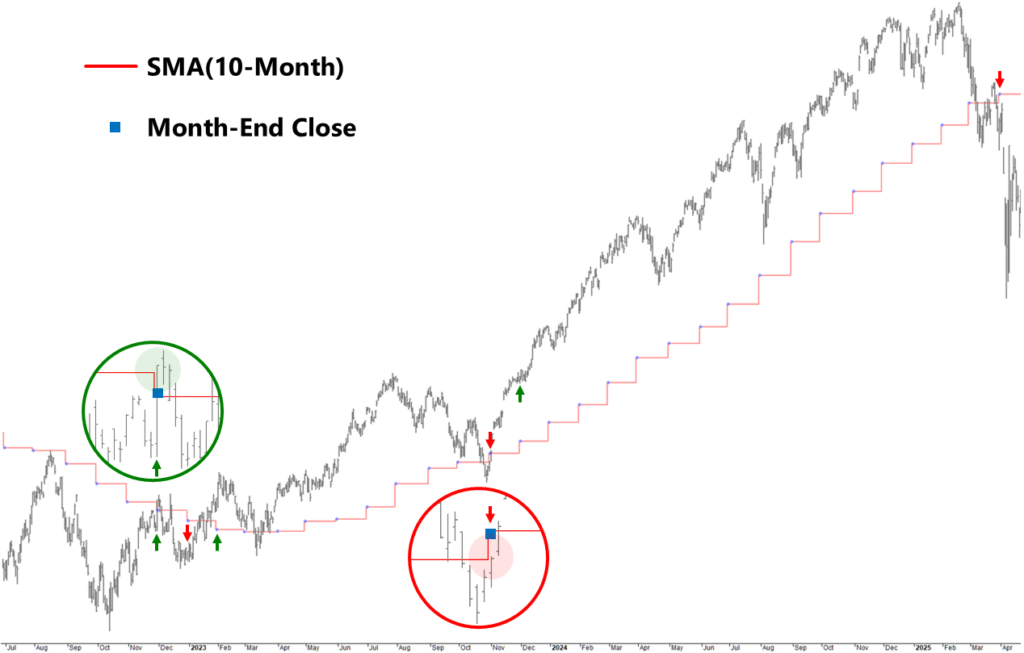
Chart labels, indicators and trading logic
Markers identify the bar where the event occurs. They are not plotted at the exact fill price.
- Red “staircase” line indicates the 10-month simple moving average.
- Blue dots indicate month-end price bars.
- Green up arrows indicate entry execution bars, filled at Close(t).
- Red down arrows indicate exit execution bars, filled at Close(t).
Entry
At Close(t) on the last trading day of the month, if the month-end close is above the 10-month SMA, signal a buy on that bar and execute the trade at Close(t) — trade-on-close; market-on-close assumption.
Exit
At Close(t) on the last trading day of the month, if the month-end close is below the 10-month SMA, signal a sell on that bar and execute the trade at Close(t) — trade-on-close; market-on-close assumption.
Equal case
If Close(t) equals the 10-month SMA, maintain the prior position.
Stay updated
Subscribe to Backtested Strategies to get alerts when new backtest videos and research articles are published.
Video transcript
Today we’re backtesting the 10-Month Simple Moving Average Timing Model, one of the most cited timing rules in finance. We’ll compare it to simply buying and holding the S&P 500 from 1994 through 2025. So, does this classic Faber timing model earn its keep, or is the opportunity cost too high? This is Backtested Strategies. Real tests. Hard data. No spin.
If you want trading ideas that have been pressure-tested in rigorous backtests with clear assumptions and transparent trade logic, you’re in the right place. Now, let’s define the strategy precisely. For this backtest we’re using daily bars on SPY from a professional data provider with prices adjusted for capital reconstructions, special distributions and ordinary cash dividends.
On the last trading day of each calendar month, we compute SPY’s 10-month simple moving average or SMA using monthly closes, including the current month-end close. On the chart, it looks like a staircase instead of a smooth curve because it only updates at the end of the month, marked as blue dots, then stays flat until the next month-end calculation. Then, we compare the current month-end close to the 10-month SMA. If the close is above, the strategy buys SPY using 100% of available equity. If the close is below, the strategy exits and goes to cash. If the close is exactly equal to the 10-month SMA, the strategy maintains the prior position.
Each strategy starts with $10,000 of capital. The backtest window runs from the start of 1994 through the end of 2025, using full calendar years. That’s over three decades of data, spanning multiple market regimes from crisis periods to long recoveries, to sideways high-noise stretches. Signals are evaluated at the month-end close and trades execute using the same bar as the signal, assuming a market-on-close order. Every trade pays 1 basis point per side in cost. That’s 1 basis point to buy and 1 basis point to sell. When the system is in cash, cash earns 0%. Canonical Faber implementations typically model cash as short-term treasury bills. BTS models cash at 0% to preserve a longer, uninterrupted backtest window and to isolate the timing rule’s contribution.
We do not model taxes, advisory fees, platform fees or financing costs. And our benchmark is straightforward: we buy SPY once and just hold it through the end of the test using the same data and cost assumptions. So, does the 10-Month Model meaningfully improve results versus Buy & Hold, or is it mostly a historical curiosity? Let’s dive into the numbers.
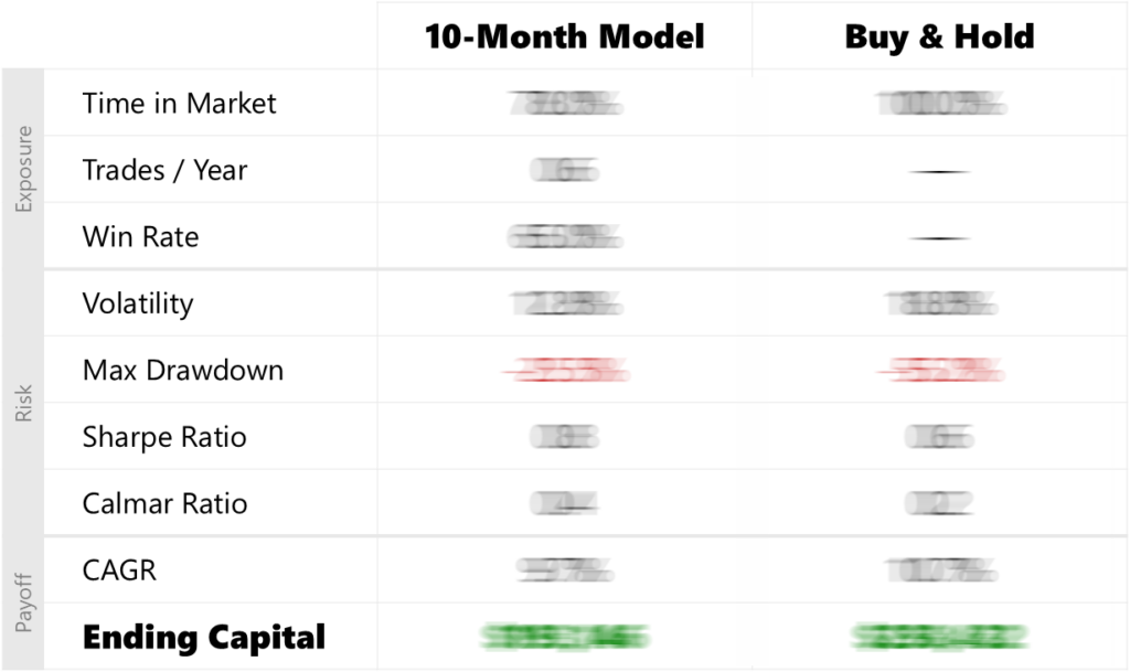
Alright, let’s have a look at the scorecard and walk through the head-to-head performance metrics. We’ll go section by section in the same order you see on screen. Section 1: Exposure. For the 10-Month Moving Average Timing Model, time in the market is 78%. That works out to 0.6 trades per year and the win rate is 65%. For Buy & Hold, time in the market is by definition 100%. Trades per year and win rate are not meaningful; the position is held continuously.
Section 2: Risk. For the 10-Month Model, volatility is 12.8% with a max drawdown of -25.5%. The Sharpe and Calmar ratios are 0.8 and 0.4, respectively. For Buy & Hold, volatility is 18.8% with a max drawdown of -55.2%. The Sharpe and Calmar ratios are 0.6 and 0.2. So, the model delivers materially better downside containment and that shows up in cleaner risk-adjusted performance. Now, let’s see what it costs in compounding.
Section 3: Payoff. For the 10-Month Model, the compound annual growth rate is 9.7% and ending capital is $193,146. For Buy & Hold, the CAGR is 10.7% and ending capital is $258,432. So, the trade-off is simple: a smoother ride, but a lower terminal wealth number.
Now that you’ve seen the scorecard, let’s look at how those results show up over time on the equity curve. The gold line is the 10-Month Model and the dark line is Buy & Hold. Here’s the key visual to watch. When the gold line is rising, the strategy is invested. When it goes flat, the strategy is in cash. That design creates the core trade-off you see on this chart.
Here are the high-signal story beats. First, the crisis-window proof points because this is where the model earns its reputation. From the Dot-com peak to the trough, the 10-Month Model is down -11.5% while Buy & Hold is down -47.5%. From the Global Financial Crisis peak to the trough, the 10-Month Model is down -6.1%, while Buy & Hold is down -55.2%. And in the COVID crash, the 10-Month Model is down -12.4% while Buy & Hold is down -33.7%.
That is the “damage control” claim in numbers and it explains why the risk metrics improve. The 10-Month Model is a low-activity system, about 0.6 trades per year, with long persistent holds when the trend is clean and extended cash stretches when the month-end signal stays negative. In fact, there are full calendar years where the strategy is entirely in cash: 2001 and 2008. That’s a big part of why the crisis drawdowns are so much smaller.
The failure mode, and this is the surprise. The strategy’s own max drawdown shows up in 2022–2023 and in that specific peak-to-trough window the 10-Month Model is down -25.5% while Buy & Hold is down -18.0%. So, “whipsaw” is not abstract here. It is what happens when price keeps crossing back and forth around the moving average, and month-end confirmation flips the regime at the wrong times.
The equity curve takeaway is simple. In sustained downtrends this model can materially reduce the depth of drawdowns. However, in choppy markets around the trend line, it can lose to Buy & Hold even while spending meaningful time in cash.
To recap, we’ve reviewed the head-to-head metrics on the scorecard and we’ve walked the equity curve, highlighting how this trading strategy behaves over time. Now, let’s step back and summarize the benefit, the cost and what role it could play in a portfolio.
Benefit: the main benefit is drawdown control in prolonged sell-offs. When the month-end signal stays negative, the model can step out and stay out and that is when the “smoother ride” shows up most clearly on the curve.
Cost: the cost is two-sided, lag and whipsaw. A monthly trend filter can re-enter late, after sharp bottoms, and it can also get chopped when price ranges around the moving average and the signal flips.
Role: given all of that, what role is the 10-Month Moving Average Timing Model best suited for? Most plausibly, it’s a rules-based trend overlay on top of a core equity allocation designed to blunt the deepest drawdowns without leverage or short selling.